ShopDreamUp AI ArtDreamUp

Deviation Actions

Tip Jar
1 Subscriber
Support my work by contributing to my tip jar. This tier won't include any specific perks, but you will receive my appreciation.
$1/month


Suggested Deviants


Suggested Collections


You Might Like…


Description
A couple of people have asked me for a tutorial. There are already more tutorials on digital painting techniques (including ones extremely similar if not identical to my own-I'm not really that unique) than you can shake a stick at, so I won't go into that; just search here on DA or Google for digital painting tutorials, you'll bring up LOADS of good ones. What I decided to do instead was just share my painting process. Mind you, I'm not great at tutorials- the extent of my teaching expertise goes pretty much as far as explaining technological things to my mother-in-law. So if you find this vague or unhelpful, just know that I tried.  Just keep in mind that the following is basically just notes that I took as I worked on this painting; it's not holy writ, just what works for me, etc.
 I start with a really shitty sketch. Like, really shitty. I refine it later on, but to start with, it's usually pretty messy. I left out the hair completely in this one at first, simply because I wasn't sure what I wanted to do with it, so I decided I'd just cross that bridge when I came to it. I use many different references, including myself (I often use my own hands for reference by propping up a mirror in front of myself or taking a photo of my hand) but I always use reference for as many things as I can find one for. Pretty much the only thing I dont usually use reference for is hair.
at this point I usually upsize my sketch, because I'm more comfortable (and usually get better results) sketching small. Of course I want it bigger than that so I can end up with a high res image for printing. I upsized this particular one 300%. This is where I start considering what the background will look like, and add some space onto the sides or crop the canvas as required. After that, I block in a really general idea of the background, and on another layer, block in the basic colors underneath the sketch. So, at this point, I've got 3 layers: the background, the basic colors, and the sketch.
after that's done, I lock the transparency on the color layer and start laying down some somewhat sloppy shading/highlights. This makes the rest of the painting a whole lot easier, because I've already got down the colors where they need to be, they only need to be smoothed out and have the details put in. I also come up with a color palette based on the basic color scheme I've already laid out. Generally, I stick with adjacent hues on the color wheel, keeping the lighting in mind. For example, I decided on a warmish/pale yellow light source for this painting, so the highlight colors would lean more toward the reds/oranges (yellow only on highly reflective parts), while the shadows were predominantly purple.
this is where I usually take it into Painter. I normally like to paint the figure itself, especially the fabric, in Painter- I just think Painter's blenders make the fabric folds easier. I normally touch up the skin in Photoshop when I take it back there, and I do the hair entirely in Photoshop, but I use Painter mainly for the clothes. I merge all the layers I've got so far into one, just to make it easier on my computer- I don't need them to be separate after this. When I get it opened up in Painter, I create a new layer on top and just start painting. I use the Detail Oils brush, Oil Pastels and Just Add Water for about 95% of the time. I wasn't having much luck with the skin in Painter for this one, so I decided to save that for when I take it back to PS. During this stage, I don't really worry if I make a mess of the background since all that will get covered up in the end.
So I brought it back into PS, where I'll do the skin on the same layer that the dress is painted on (still only 2 layers at this point- underpainting/sketch and main painting). Depending on the painting, I might decide to do the skin on a separate layer if I feel like it might help, nothing's carved in stone here. I just usually try to keep my layers down because I've often got other things running while I paint (Dark Shadows, anyone?) and it keeps things running smoothly- especially when I'm using Painter, since it's quite a heavy program. I did quite a bit of tweaking here- corrected some anatomy mistakes (select problem area then edit>transform>warp- it's a godsend) and corrected the colors a bit on the dress and skin; I found the shadows to be a bit too saturated (Image>Adjustments>Replace color). After a while I started to lose my patience with correcting the color on 2 separate layers and just merged them into one. I'll be straight up honest, I liquefied/warped the shit out of this- you can probably see where I shifted her arm to narrow her shoulders, as well as other little edits all over. I do this frequently with my paintings, because I can't always spot the mistakes early on, even when constantly doing a horizontal flip (which I do anyway). And sometimes they're not even mistakes, I just change my mind. 
Next I did the wings and the hair, each on their own layers, with the hair on the topmost layer. I still wasn't sure what color I wanted the hair, so I did a layer with blonde and a layer with pink to see what each one looked like, and decided to blend them together- I put the pink layer on top of the blonde and masked out the top part of it with a spackled brush to make it fade into the blonde. Then I went back to the bottom layer and painted in the shadows that the hair would cast on her shoulders and such. I also did a very slight overall
hue and saturation shift here, because I decided I wanted the pink to be warmer and brighter.
Now that I've got the figure painted, I'll do the background. The way I do backgrounds is a little backwards, and some people might think it's really weird and tedious, but it's what works for me. I make a new layer with only the hair above it (I leave the hair out because the edges are too complicated) and fill it with some color which is going to really stand out, usually the complimentary color (in this case I chose green) so it's easy for me to see. Then, I create a mask on that layer and mask out the figure, and from there I can just go nuts with the background and paint whatever I want, and so long as the mask is still intact, it doesn't matter that the background layer is on top- nothing will get on the figure. Hopefully the pictures I've provided give a better idea than my explanation does. I also brought the size in a little, since I felt there was too much empty space.
Now, I do the butterflies. Confession time: I cheat here, too.  (Wink)") I paint one wing, and then copy that to make all the others, flipping, turning and distorting it as needed with the transform tool (is that what it's called? The topmost tool that's a little black pointer with a cross. jeez, I'm technical. lol), and drawing in only the bodies individually. If anybody's going to tell me that doing this is wrong/cheating, then I'll tell them that driving a car to work instead of walking there, buying vegetables from the store instead of growing your own, and sending emails instead of letters by regular post are also wrong. Oh and also that they should quit sucking lemons and kiss my ass. lol But anyway, after the butterflies are done, I paint in any shadows that they might cast. Then I make a new layer and brush on the sparkles (which are a custom brush set to scatter) and then underneath that, I airbrush a light pink color onto an overlay layer to give the sparkles a little glow.
I paint one wing, and then copy that to make all the others, flipping, turning and distorting it as needed with the transform tool (is that what it's called? The topmost tool that's a little black pointer with a cross. jeez, I'm technical. lol), and drawing in only the bodies individually. If anybody's going to tell me that doing this is wrong/cheating, then I'll tell them that driving a car to work instead of walking there, buying vegetables from the store instead of growing your own, and sending emails instead of letters by regular post are also wrong. Oh and also that they should quit sucking lemons and kiss my ass. lol But anyway, after the butterflies are done, I paint in any shadows that they might cast. Then I make a new layer and brush on the sparkles (which are a custom brush set to scatter) and then underneath that, I airbrush a light pink color onto an overlay layer to give the sparkles a little glow.
About 90% of this is how I do all of my paintings. The only thing I do different sometimes is starting out the painting; sometimes, instead of doing a line sketch, I just block in the forms with a large brush and use that as my starting point.
But I hope this was helpful to someone, and if you have any questions, feel free to ask me and I will try to answer the best I can.
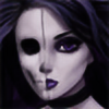
Here is the finished painting:

hue and saturation shift here, because I decided I wanted the pink to be warmer and brighter.
About 90% of this is how I do all of my paintings. The only thing I do different sometimes is starting out the painting; sometimes, instead of doing a line sketch, I just block in the forms with a large brush and use that as my starting point.
But I hope this was helpful to someone, and if you have any questions, feel free to ask me and I will try to answer the best I can.
Here is the finished painting:
Image size
600x5704px 584.51 KB
© 2012 - 2024 Enamorte
Comments15
Join the community to add your comment. Already a deviant? Log In
lol that shitty really shitty. damn I must be the worst drawer in the world XD hahaha I love it thanks for the tuts.